Bromley & Croydon's Women's Aid

The project
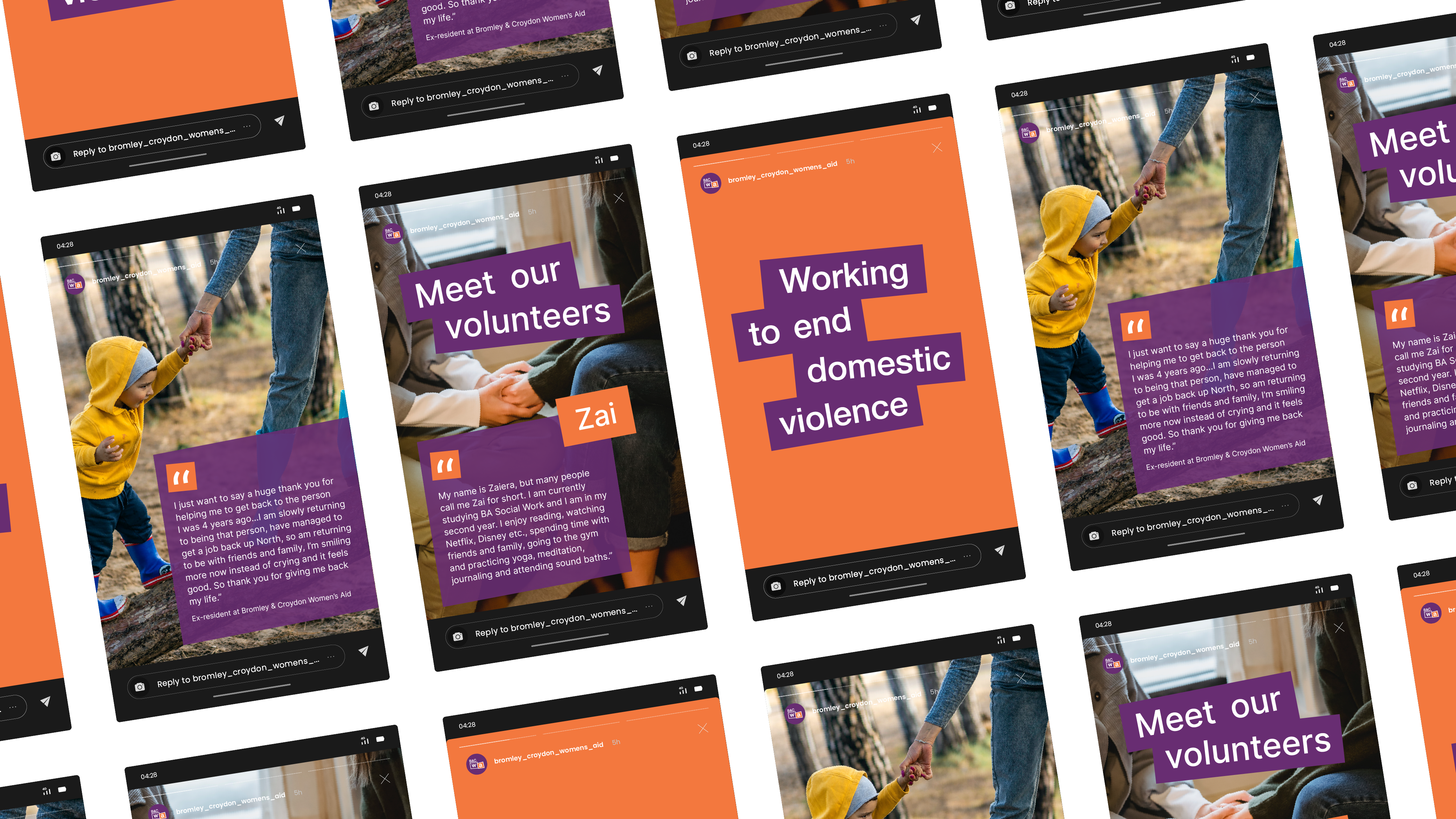
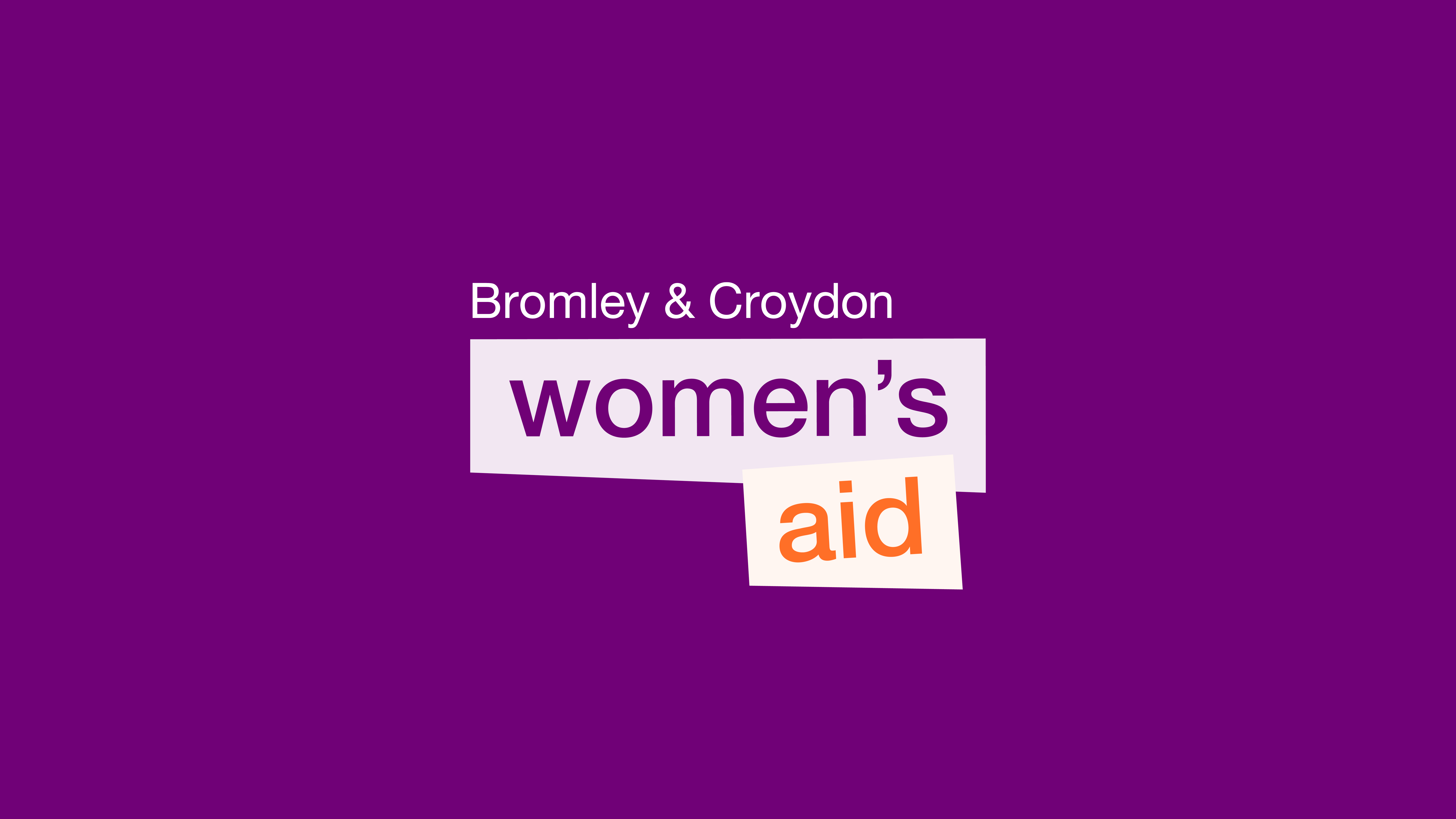
Bromley & Croydon Women’s Aid (BCWA) is a refuge for women to grow, evolve and rebuild their lives. It is a charity founded in strength and bravery. It was important to BCWA that their logo would be the driving force to highlight their core brand values.
BCWA wanted to emphasise that their charity focusses on the future, not the past, and helping the recipients of their support to create the best future possible for themselves.
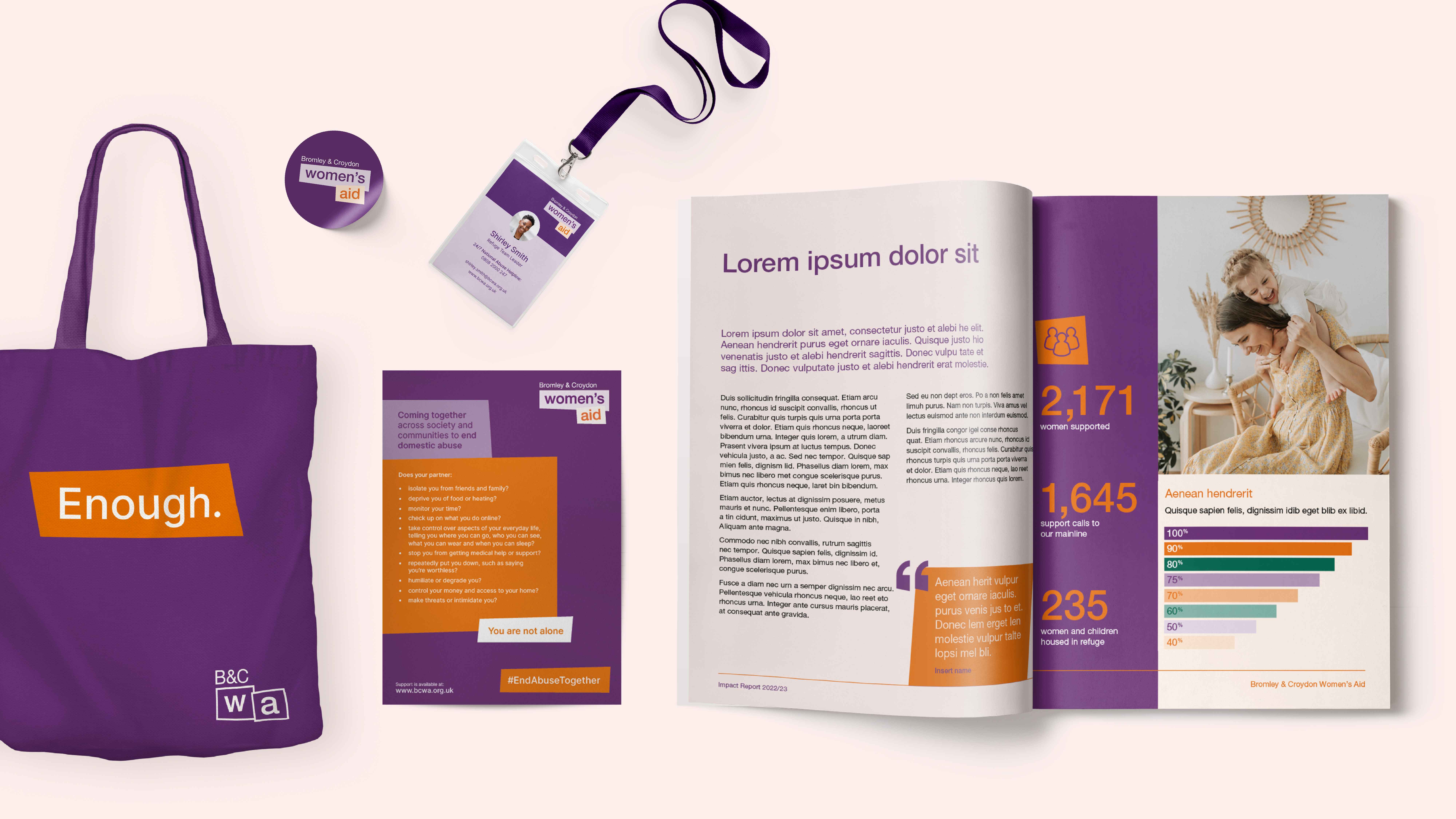
You will see through this project that the core colours chosen are purple and orange to represent strength and bravery. The blocks upon which the logo is built are much like the foundation BCWA help to restore, they might be a little crooked but they are a strong base to build upon.
The brief
Rebrand Bromley & Croydon Women's Aid, starting with redesigning the BCWA logo with an outlook of evolution and strength
About
Project oveview
BCWA rebrand
Project gallery